
The Pathogen Intelligence Center offers a number of internal and external tools to assist in genomic surveillance and investigation.
ASAP: Amplicon Sequencing Analysis Pipeline
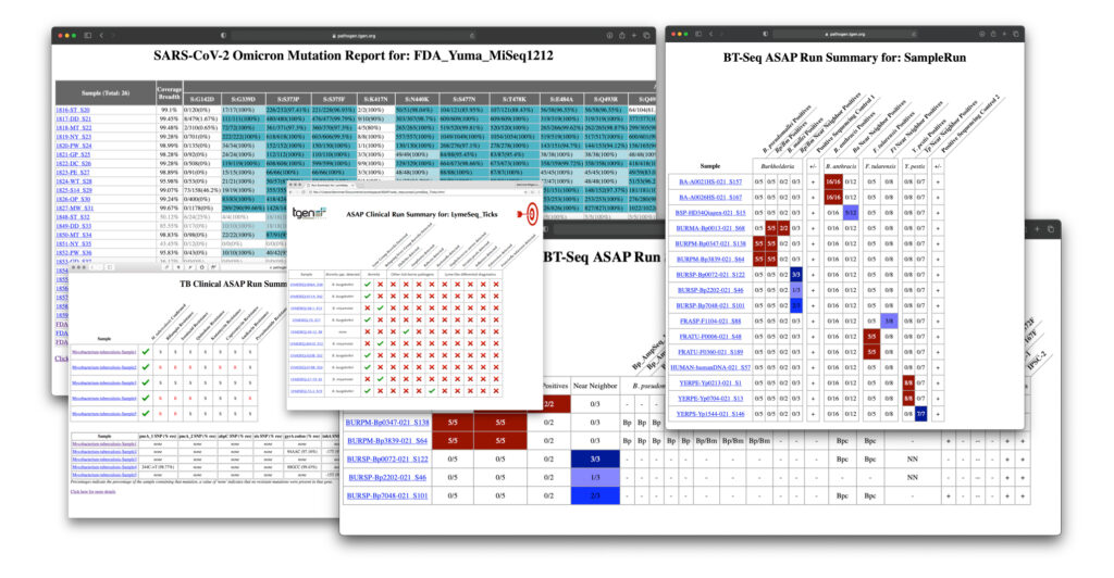
ASAP is a highly customizable, automated way to examine amplicon sequencing data. Developed in-house at TGen North, ASAP is used regularly to analyze SARS-CoV-2, tuberculosis, and Group A Strep emm type data. To learn more, please visit ASAP’s GitHub page. See image below for an example of an ASAP output.
BEAST: Bayesian Evolutionary Analysis Sampling Trees
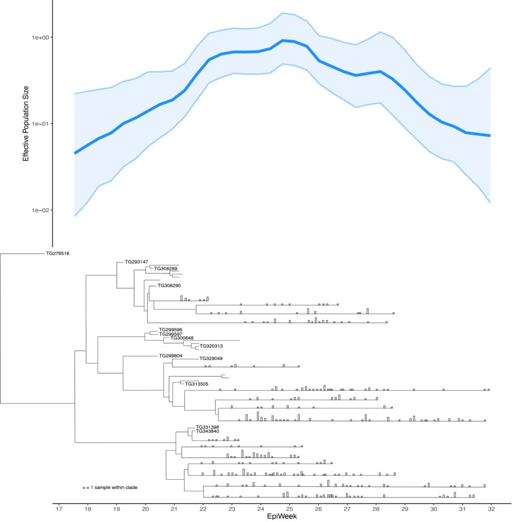
From the BEAST website: “BEAST is a cross-platform program for Bayesian analysis of molecular sequences using Markov chain Monte Carlo integration.” At TGen North, BEAST was most recently used to construct SARS-CoV-2 phylogenetic trees and effective population size figures for COVID-19 outbreaks within an Arizona tribal community.
Epi Tools: In-house analysis pipelines
Epi Tools are a collection of in-house genomic surveillance, outbreak analysis, and antibiotic resistance pipelines to identify disease clusters, elucidate transmission patterns, and track antibiotic resistance spread in clinical settings, respectively.
NASP: Northern Arizona SNP Pipeline
“NASP is a pipeline for analysis of genomic data. It is a suite of tools meant to collect and report on statistically-relevant, high-confidence positions in a collection of genomes, with emphasis on variant positions, especially single nucleotide polymorphisms (SNPs).” The Pathogen Intelligence Center uses NASP to compare genomes to each other for outbreak analysis and source tracing. To learn more, please visit NASP’s GitHub page.
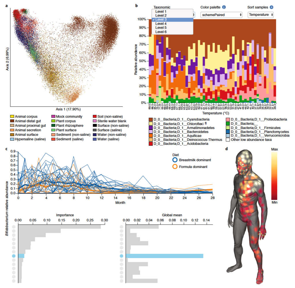
QIIME 2: Next-generation microbiome bioinformatics platform
QIIME (pronounced “Chime”) 2 is an open source platform for tracking, visualizing, and sharing microbiome data and analyses and is the world’s most highly cited microbiome bioinformatics platform. QIIME 2’s development was led by Dr. Greg Caporaso, an adjunct associate professor at TGen North. You can read more about this tool here. See image below for examples of different visualizations produced by QIIME 2.
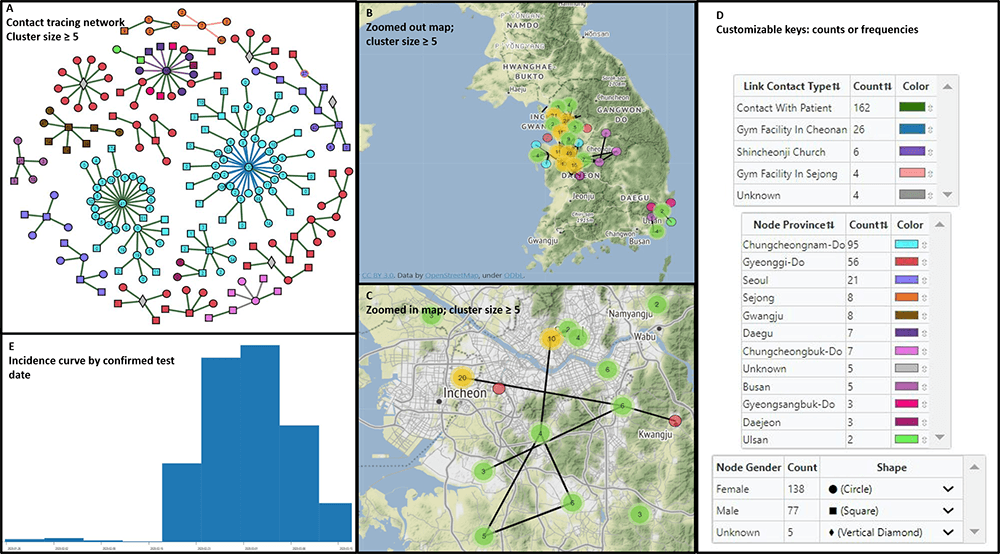
MicrobeTrace: Rapidly visualizing molecular epidemiology
MicrobeTrace was developed to support public health interventions through providing tools to integrate, visualize, and analyze data from multiple sources. See image below for an example of a “data dashboard” MicrobeTrace visualization.
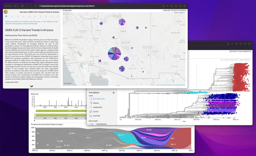
Nextstrain: Real-time tracking of pathogen evolution
Nextstrain is an “open-source project to harness the scientific and public health potential of pathogen genome data.” Within the Pathogen Intelligence Center, Nextstrain is used to build phylogenetic trees to track the spread and evolution of pathogens such as SARS-CoV-2. To learn more about Nextstrain’s capabilities, visit their website.
Microreact: Open data visualization and sharing for genomic epidemiology
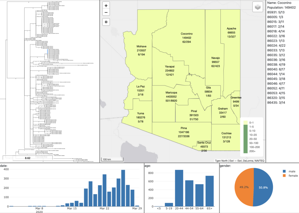
Microreact is a visualization tool for linking phylogenetic data with metadata, such as location, date, and pathogen characteristics. In collaboration with the CDC, Microreact has been used by the Pathogen Intelligence Center to determine the spread and distribution of last-resort antibiotic resistance across US hospitals. If you’d like to explore Microreact, you can visit their website here. See image below for an example of Microreact visualizations.
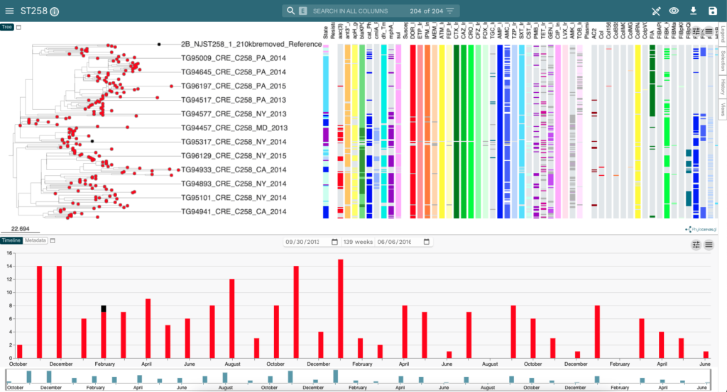
collection date timeline (bottom).